Jacob Oliver Branding and web-design
Jacob Oliver is a British jewellery company based out of London. The company traditionally sold primarily through word of mouth and had been unsuccessfully building a web presence over the past few years. I was approached in December last year to begin working directly with one of the directors in a long re-branding project, aiming to be fully operational before this years Christmas period.
Initially I started with the logo and decided upon the graphical direction I was going to take. As the company and directors had very strong African links and sell regularly in the region, they wanted a traditional British feel about the companies branding – knowing how this would positively impact their reputation in these target markets. I looked at all of the gigantic jewellery institutions in the UK past and present and felt they could be best replicated through a crest design. This crest incorporated as many historic symbols of both the United Kingdom and Africa as I could harmoniously fit together and was modernised with the sans-serif text situated either side.
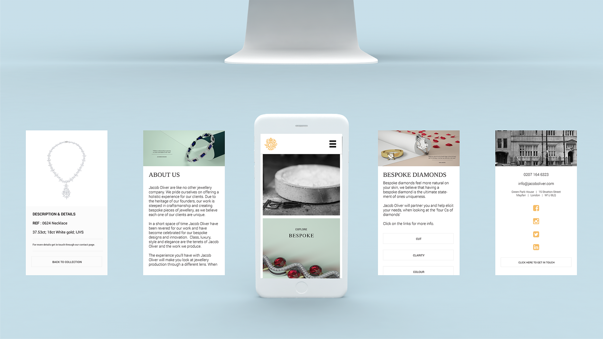
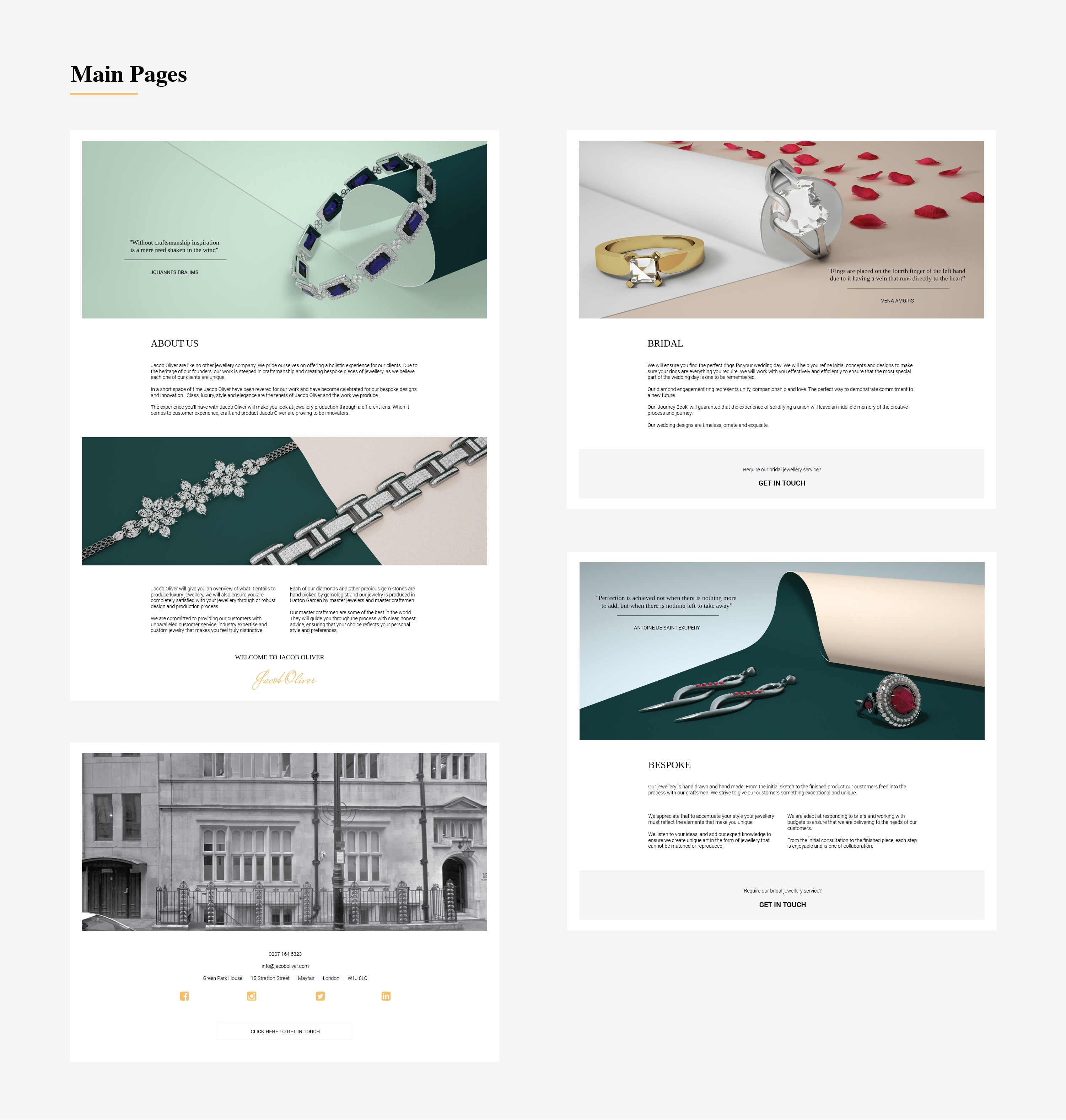
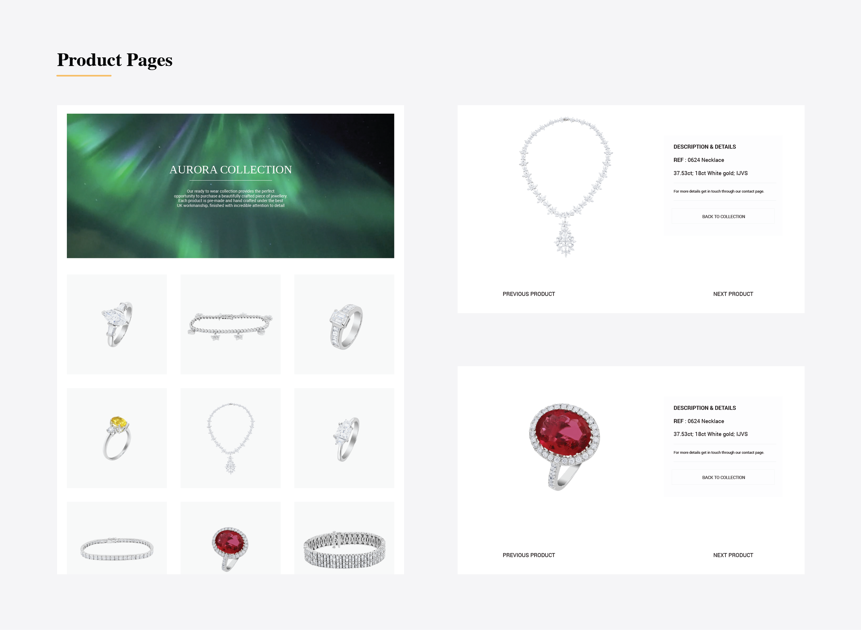
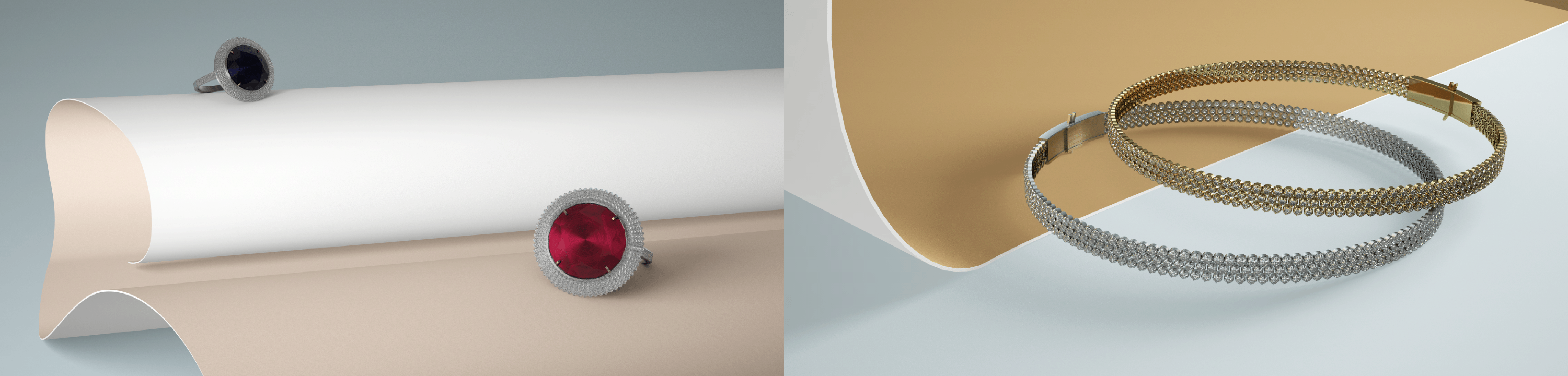
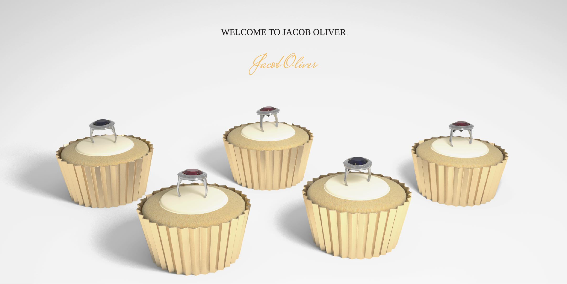
The website was a massive under-taking mostly due to the unavailability of images. Nearly all of the jewellery Jacob Oliver produces are for one-off orders where the customers don’t tend to like having their personal pieces showcased. This meant I had to spend hundreds of hours modelling and rendering as many of the unused sketch designs lying around the workshop in the 3D before I could begin on the main site design.
One big saving factor in time was the decision not to include an e-commerce element as the directors wanted to maintain the personal approach and instead preferred potential customers to call and discuss designs and pre-mades they had seen on the site and would like to buy.
Programs used
- Adobe Illustrator
- Adobe Photoshop
- Cinema 4D
- VRay
- Adobe After Effects
- Adobe Lightroom
- Wordpress