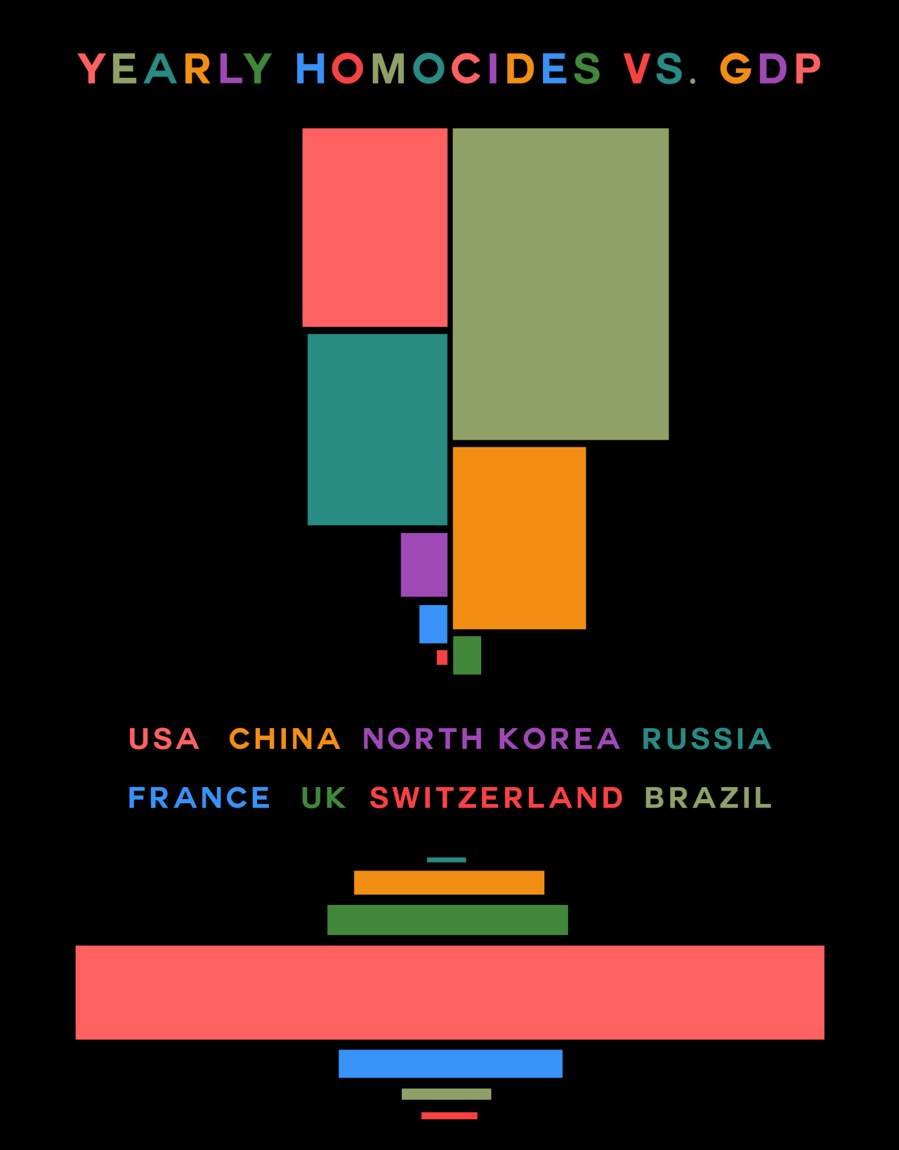
We were looking at ways of representing data visually, in a way that makes it almost piece of art.
I drew inspiration from the website http://www.informationisbeautiful.net/ and created my own graphs.
The trend I was looking at was the link between the Annual GDP of a country against its Annual Homicide rates.